Detailed Descriptions
Detailed descriptions of the charts, graphs, and figures in the Biostatistics module, when not otherwise provided.
Lesson 4
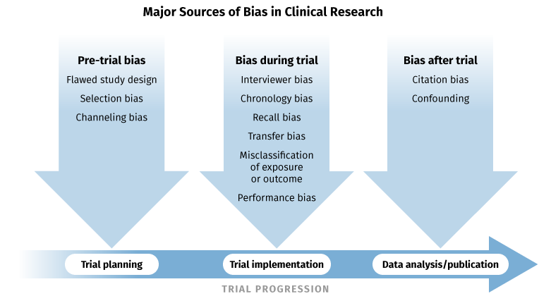
Figure 1: Major Sources of Bias
A diagram outlining the major sources of bias in clinical research that correspond to each stage of the trial progression. The trial planning stage is subject to pre-trial bias, which includes flawed study design, selection bias, and channeling bias. The trial implementation stage is subject to bias in the form of interviewer bias, chronology bias, recall bias, transfer bias, misclassification of exposure or outcome, and performance bias. The data analysis/publication phase is subject to citation bias and confounding.
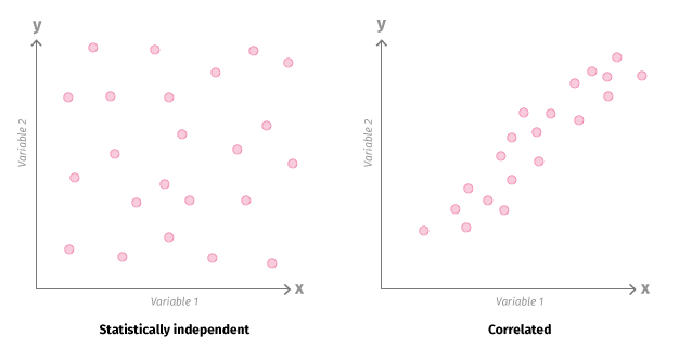
Figure 2: Data Relationships
A generalized representation of data relationships, with variable 1 represented on the horizontal X axis, and variable 2 on the vertical Y axis. Statistically independent data points appear in a random but generally uniform distribution pattern, while correlated variables tend toward a single diagonal distribution, with the X values and Y values roughly equal for each data point.
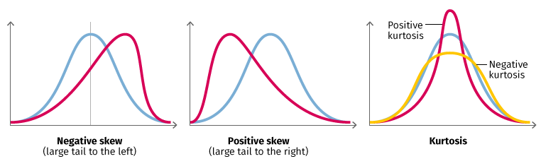
Figure 3: Data Parametrics
Three graphs showing concepts related to parametric data–skew and kurtosis. A normal distribution of data looks like a standard bell curve that peaks in the middle, while data that is negatively skewed, as in figure 1, peaks to the right and has a large tail to the left. Figure 2 shows positive skew, with a peak to the left and large tail to the right. Kurtosis refers to the height of the peak. Positive kurtosis implies more centrally distributed data, so the curve has a higher, sharper peak, while negative kurtosis is indicated by a broader, lower peak, implying more broadly distributed data.

Figure 4: Example of Correlated vs Independent
Two scatter plots demonstrating correlated versus independent variables. In the first, the relative viability of ofatumumab is charted on the X axis, and the relative viability of rituximab is represented on the Y axis. Aside from a few outliers, the data points are distributed closely around an increasing diagonal line, indicating positive correlation of these two variables. The second plot shows CD20 mRNA expression in log2 units on the X axis, and relative viability of rituximab on the Y axis. No clear correlation exists, meaning a higher mRNA expression doesn’t necessarily imply an increase in relative viability.
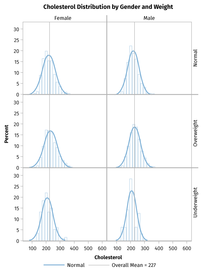
Figure 5: Example of Data Distribution
Six separate graphs, each showing cholesterol on the X axis (ranging from zero to 600) and distribution percentages on the Y axis. The graphs are divided by gender and weight. Most show cholesterol levels from under 100 to over 300, with peak cholesterol levels around 220, and the peaks generally represent 18 percent of the total population. The data for underweight populations are skewed slightly, with peaks at lower cholesterol levels, and show higher kurtosis, with peak data representing 20 to 25 percent of the population.
Lesson 6
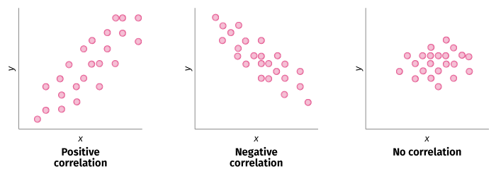
Figure 1: Types of Correlation
Generalized diagrams of the concepts of correlation. Positive correlation means that a higher value of X implies a higher value of Y for each data point. Negative correlation means that higher values of X correspond to lower values of Y for each data point and vice versa. No correlation implies no discernible pattern between the two variables.

Figure 2: Multiple Regression Equation
A scatter plot with an overlaid line of regression representing the data trend. The equation of this line is outcome (or Y value) equals a constant, 2.45, plus 0.5 times weight, plus 0.92 times age, plus 3.2 times years of smoking.

Figure 3: Regression Example
Figure: Association between A1C and adherence, adjusted for baseline A1C and the ODM regimen. Footnote: Metformin plus a sulfonylurea was used as the reference group for the index ODM regimen. A1C indicates glycosylated hemoglobin; ODM, oral diabetes medication. Percentage adherence is indicated on the X axis, and adjusted A1C on the Y axis. The line of regression trends downward.
Lesson 9

Figure 1: Logistic Curves
Two examples of logistic curves, which appear as S-shaped tangent curves ranging from zero to one on the Y axis. The Y values of all data points are binary, falling into either one of two values. In the better fit relationship, the y = 0 data points are grouped more closely to the far left, and the y = 1 data points are grouped to the far right, meaning that the S-shaped tangent curve more closely aligns with the distribution of data points.
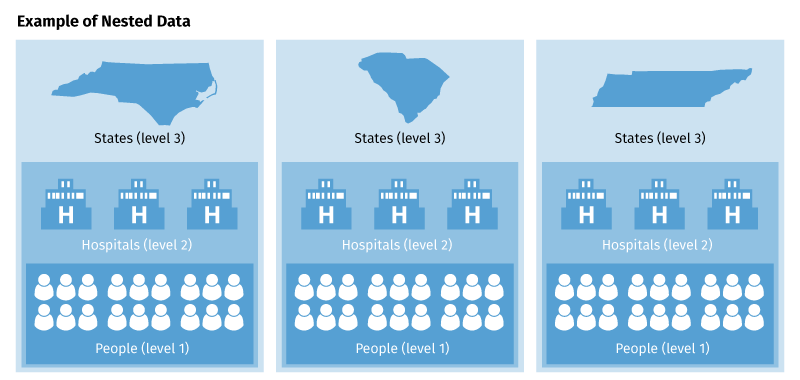
Figure 2: Nested Data
A representation of a nested data model. Three vertical columns contain three levels of analogous but statistically distinct data: the top level of each column (level 3) shows three different states, level 2 shows hospitals within each respective state, and the bottom level (level 1) of these columns includes the people in each hospital within each state.
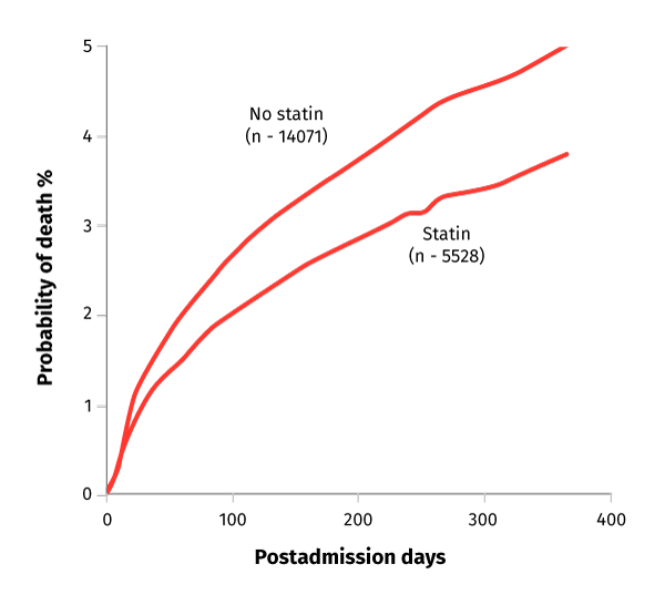
Figure 3: Mortality Probability Graph
A graph representing the probability of death (along the Y axis) as a function of postadmission days (along the X axis). Two lines represent the trends with statins and without. Both spike sharply in the early days and continue to increase at a slower rate as the results approach days 300 and 400. The rate of increase amongst those taking statins (n – 5528) was less than those taking no statins (n – 14071).
Test Selections
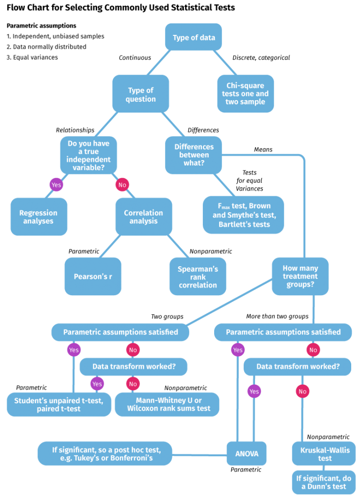
Figure 1: Flow Chart For Selecting Statistical Tests
A flow chart for selecting commonly used statistical tests. Parametric assumptions include independent, unbiased samples, normally distributed data, and equal variances. First, decide the type of data. Discrete, categorical data indicates a chi-square tests one and two sample, while continuous data requires further investigation. If measuring relationships, determine if you have a true independent variable. If yes, perform regression analyses, and if no, perform a correlation analysis. Parametric correlation analysis calls for a Pearson’s r test, and nonparametric analysis suggests a Spearman’s rank correlation. For continuous data measuring differences, determine the nature of those differences. Tests for equal variances call for either an F-max test, a Brown and Smythe’s test, or Bartlett’s tests. If measuring differences in means, determine how many treatment groups are involved. For two groups, if either parametric assumptions are satisfied or the data transform worked, use a Student’s unpaired t-test or paired t-test. If neither the parametric assumptions were satisfied nor the data transform was successful, use a Mann-Whitney U or Wilcoxon rank sums test. For more than two groups, if either the parametric assumptions are satisfied or the data transform worked, use ANOVA, otherwise use a Kruskal-Wallis test. If ANOVA is significant, do a post hoc test such as Turkey’s or Bonferroni’s. If the Kruskal-Wallis test is significant, do a Dunn’s test.